As the first design hire at Pflegewächter, I led the Design System execution, focusing on bringing consistency, improving accessibility and streamlining hand-off processes between Design & Engineering.
I worked closely with a team on a new processes and laid the foundations of the design system.

Context
When I joined Pflegewächter, I inherited a product built by a small engineering team utilizing basic MUI components. The platform faced significant accessibility compliance gaps and UI inconsistencies, creating significant barriers to scaling and future growth.
Goal
The goal was to speed up our transition from solution to implementation in design and development and create consistent user experiences while maintaining rapid iteration cycles.
Impact
Reduced design inconsistencies and technical debt by implementing reusable components.
Enabled our team to work in parallel by implementing clear contribution and review processes.
Timeline
Sep 2024 - Mar 2025
My Role
Product Designer
Industry
LegalTech
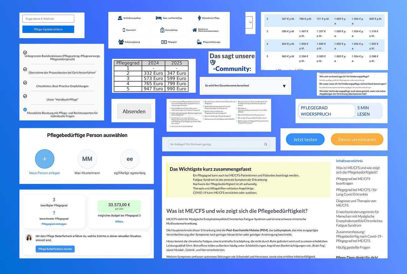
Before & After


The Foundation Challenge: Rebuilding While in Flight
My first weeks revealed critical inefficiencies: engineers recreating similar components across pages, inconsistent design decisions confusing users, and a growing disconnect between Figma designs and production code.
With the tech stack being reworked, we needed more than just components – we needed a systematic approach that would align design with development, enable rapid iteration, and ensure consistency at scale.

Building the Design Core
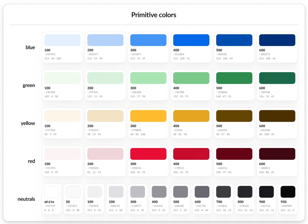
We approached the challenge by creating a comprehensive UI library from scratch, designed to unify our design and development workflows. The foundation was built on 3 core Figma libraries:
Foundations Library
Core design tokens: typography, colors, spacing, grids
Enabled consistent design decisions across teams
Semantic system for consistent implementation
Semantic naming conventions
Design tokens for consistent implementation
Bridging design decisions with code
Components Library
Reusable UI elements and patterns
Built for modularity and scale


Source of Inspiration
This insight from a Dive Club podcast episode with Henry Modisett helped me find clarity in approaching this challenge.
We didn't know what the product was going to be… we didn't know how it was going to work… but it probably needed buttons, a type system, a color system, etc.”
— Henry Modisett
The result
The new design system transformed our workflow and delivered measurable results:
Created a single source of truth for design and development teams
Reduced implementation time for UI changes
Established a scalable foundation for product growth
Improved team collaboration through structured documentation


What I’d Improve Next Time
Three key areas for enhancement: implementing a more detailed token system from the start, involving developers earlier in component architecture, and incorporating user testing for UI variations before finalization.